2015-08-12
 574
574
Task 5.
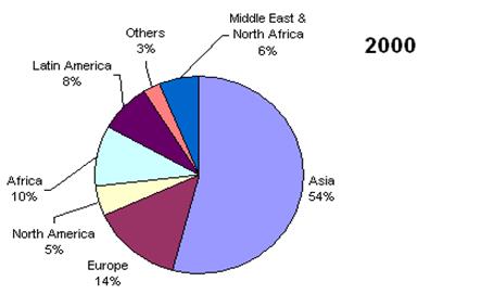
Task 6. The charts show changes in the proportion of world population from different regions in 1900 and 2000 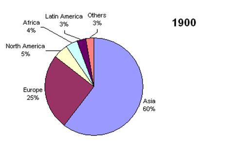
Task 7.
a) True or False?
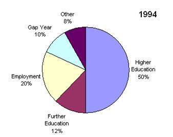
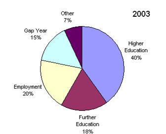
1. More pupils went into higher education in 1994
2. 136 pupils went into employment in 2003
3. More pupils decided on a gap year in 2003
b) Describe the pie charts that analyze what students at one sixth-form college (last year of secondary school) in the UK did after finishing school in 1994 and 2003
Pupils
Pupils
Task 8. Pie chart dictation (time, comparisons)
Listen to your teacher dictate a model essay. Fill in the gaps below and label/divide the charts according to percentages (%) for items.
Title: ________________________________________________________________
Pie chart 1: ______________________________
 |
Pie chart 2: ______________________________
 |
Review of Bar Graphs