Now that we understand all the pieces that go into a bar graph we are ready to discuss the analysis of a bar graph. As you can see, being able to do some data analysis of bar graphs can be more complicated then it initially looks. Keep in mind that parts of this process, such as doing an overview of the titles of the table and axes, are done quickly. The parts that may take more practice are determining the type of data groups being presented, whether the scale is appropriate, and making comparisons between groups of data. For example, in the bar graph Price of Corn versus Quantity Demanded, what information is being displayed in this bar graph?
Price of Corn versus Quantity Demanded
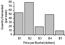
If we begin by looking at the axes we notice that the data groups are ordinal, going from a low of $1 to a high of $5. We also may notice that there does not appear to be any trend in going from low to high values of Price per Bushel. One thing we can see here is how difficult it can be to determine exact amounts from a bar graph. For example, at a price per bushel of $3, it is hard to tell whether the quantity demanded is 19, 20, or 21. While specific information of data groups may be difficult to determine, we can make a quick comparison.
 2015-08-12
 452
452


