2015-08-12
 557
557A bar graph is a visual display used to compare the amounts or frequency of occurrence of different characteristics of data. This type of display allows us to:
· compare groups of data, and
· to make generalizations about the data quickly.
| When reading a bar graph there are several things we must pay attention to: the graph title, two axes, including axes labels and scale, and the bars. Since bar graphs are used to graph frequencies or amounts of data in discrete groups, we will need to determine which axis is the grouped data axis, as well as what the specific groups are, and which is the frequency axis. | Price of Corn versus Quantity Demanded 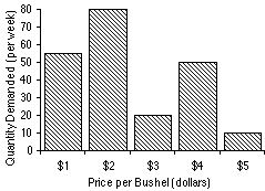
|
The height of the bars is particularly important since they give us information about specific data.
Parts of a Bar Graph
Now let's look at the components of a bar graph individually. There is a lot of information in this section so you may wish to jot down some short notes to yourself.
| · Graph Title--The graph title gives an overview of the information being presented in the graph. The title is given at the top of the graph. · Axes and their labels--Each graph has two axes. The axes labels tell us what information is presented on each axis. One axis represents data groups, the other represents the amounts or frequency of data groups. · Grouped Data Axis--The grouped data axis is always at the base of the bars. This axis displays the type of data being graphed. | 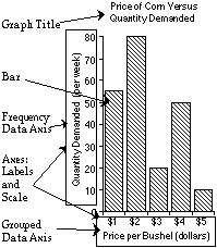
|
· Frequency Data Axis --The frequency axis has a scale that is a measure of the frequency or amounts of the different data groups.
· Axes Scale -- Scale is the range of values being presented along the frequency axis.
· Bars --The bars are rectangular blocks that can have their base at either vertical axis or horizontal axis (as in this example). Each bar represents the data for one of the data groups.
Now let's look more closely at how the elements of a bar graph help us get a handle on the information presented in a graph. While there are several ways to do this, here we will present one way to get an overview of a graph using the graph above.
· Graph Title --provides an overview of the type of information given in the bar graph.
For the bar graph given, the title indicates that we are looking at data on:
Price of Corn versus Quantity Demanded
| · Axes and their labels--The axes labels tell us what information is presented on each axis. One axis represents data groups is labeled Price per Bushel. The other axis is labeled Quantity Demanded. · Bar--rectangular blocks that can have their base at either the vertical axis or horizontal axis. For this graph we can see that the base of the bars are on the horizontal axis. This means that the grouped data axis is the horizontal axis and the frequency axis is the vertical axis. | 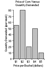
|
· Vertical axis --This axis is the frequency axis and contains the quantity demanded given in units of bushels.
· Grouped Data Axis-- Since the grouped data axis is always at the base of the bars, the grouped data axis is the horizontal axis. The axis label tells us that along the horizontal grouped data axis we have the price per bushel, with each data group being a different dollar amount from $1 to $5.
Two important pieces of information we must determine are the:
· type of data being counted, and
· how the data is grouped.
· Frequency Data Axis --The scale is the range of frequency values shown on the graph. The span of values represented is determined by the lowest and greatest values you wish to include on the graph.
| When looking at this axis, look to see where the range begins and ends, as well as at the interval between tick marks. The vertical axis is the quantity demanded given in units of bushels. In this case, the frequency scale goes from 0 to 80, and uses an interval of units of 10. The frequency of our data groups range over nearly the entire scale so we are able to get a good picture of our data. | 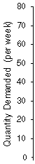
|