2018-01-08
 160
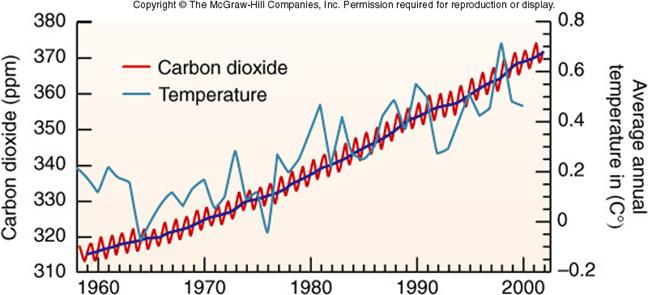
160The graph below represents evidence that supports global warming theory. Two curves: carbon dioxide (CO2) concentration in the atmosphere and temperature plotted versus time are given for the second part of 20th century.
a) From the graph find maximal and minimal carbon dioxide concentrations in years between 1970 and 2000. Calculate the relative rise in annual CO2 emissions (in %) during period of time 1970-2000 yrs.
b) Estimate average annual increment into CO2 concentration change for the time period of 1970 – 2000.
c) Based on the results received in (b) predict (calculate) CO2 concentration for 2010.
d) Compare the number received in c) with real CO2 concentration in the atmosphere, equal to 390 ppm.