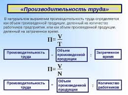
2015-08-12
 694
694Circle graphs, also called pie charts, are a type of graph used to represent a part to whole relationship.
· They are circular shaped graphs with the entire circle representing the whole.
· The circle is then split into parts, or sectors.
· Each sector represents a part of the whole.
· Each sector is proportional in size to the amount each sector represents, therefore it is easy to make generalizations and comparisons.
An example of a circle graph is given below.
Revenue Sources for the Federal Government
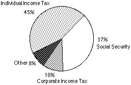
When reading this circle graph we look for the following pieces of information: the graph title, individual sectors and their relative sizes, and the sector labels (one for each sector). Let's take a closer look at each of these.
| Graph Title--A graph title gives an overview of the information displayed in the graph. The title is given at the top of the graph. Sectors--Each sector represents one part of the whole. The size of each sector represents its fraction of the whole. Sector Labels--The label of each sector indicates the category of information it refers to, and may also give numeric data (often a percentage) so we know the size of each sector. | 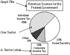
|
Let's use the circle graph given here as an example of how to get information from a circle graph. Looking at the elements of this graph we find:
· Graph Title --The title gives an overview of the information displayed in the graph.
The title of this graph is: