2015-08-12
 501
501We would expect the graph associated with this title to contain the names of different sources of revenue for the federal government, with some information on the relative amounts from each revenue source.
· Sectors - Each sector represents one part of the whole.
| The graph below contains four different sectors. This means the graph displays four different sources of revenue. The largest sector is a little less than half of the whole circle. There is another source that is also relatively large, and then there are two smaller sources of revenue. | 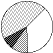
|
· Sector Labels --Sector labels indicate the category of information represented in the sector and may also give numeric data (often a percentage).
The graph has a label for each sector. Each label shows what type of revenue it corresponds to, and the percentage of the whole for that sector. From the graph we can see:
| 1. The largest sector, 45% of the total revenue, comes from individual income tax. 2. The smallest sector, 8%, comes from sources listed as other. 3. Individual income tax provides four and a half times as much income as corporate income tax Revenue Sources for the Federal Government | 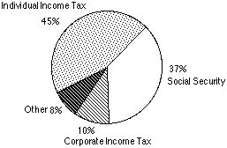
|
We determine this by finding the ratio of Individual Income Tax to Corporate Income Tax. From the circle graph we know this is 45:10, which is 4.5:1.
When a circle graph is presented, it is necessary to make statements about the sectors of the graph, relative to one another, and relative to the entire circle. From this one example, we can see the amount of information we can get, and all from looking at one circle graph! Now, let's try an example of reading a circle graph and answering specific questions about the data presented.