2015-08-12
 2071
2071Paragraph 1: Describe what sort of chart it is and what it is about
Paragraph 2: Describe the sections of the graph starting with the biggest and working your way down.
Paragraph 3: A short conclusion giving an overall view of what the chart is about.
Example
The graph shows what apples are used for in the US.
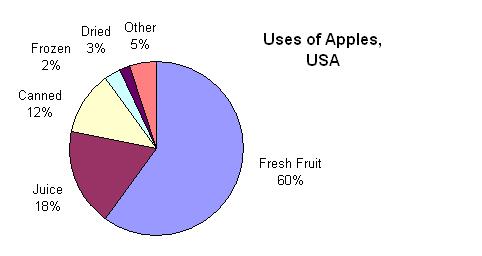
The graph shows the chief uses of the apple crop in the US. Overall, the bulk of the harvest is either eaten fresh or made into juice.
The biggest slice of the pie-chart is taken up by fresh fruit. About 60% of the crop is eaten fresh. This is three times as much as the next use, which is for juice. Less than 20% of apples in the US are turned into apple juice. A further 12% is canned, and a total of 5% is either frozen or dried. Other remaining uses, such as apple vinegar, account for just 5% of the crop.
It’s clear that although a small amount of apples are processed into frozen, dried or canned products, the great bulk of the crop is sold straight from the tree.