TEXT В
STANDARD TYPES OF GRAPHS
There are many different types of graphs that may be included with both spreadsheet-based graphics programs and dedicated-analysis graphics programs.
Pie Chart. A pie chart is used most effectively when you want to compare the way in which individual parts relate to the whole. It is called a pie chart because it looks like a piece of pie cut into wedge representing one of the items under comparison.
Generally, analysis graphics software provides a set of patterns or colors that can be used to further differentiate between the various pieces of the pie chart.
Generally, you shouldn’t use more than about ten wedges in the pie or it may become too confusing.
Line Graphs. Line graphs can be used to look at trends that continue over a period of time. They are especially useful when comparing the values of two different variables on the same graph. With line graphs, points are marked out along a vertical and horizontal axis and then a line is drawn between the points.
The angle of the line along the vertical axis represents the trend and the distance of the line from the horizontal axis usually represents a quantity. When a second category is to be compared, a separate line is drawn between the points that indicate that category.
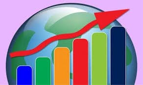
Bar Graphs. Bar graphs use bars along a vertical or horizontal axis to illustrate differences among individual items. This type of graph is particularly valuable when you want to portray differences in size and quantity. Although the bars can run either horizontally or vertically, the vertical axis (y-axis) generally measures quantity and the horizontal (x-axis) measures the values for each category being compared.
The values for the different categories being compared are often represented by bars with different patterns or colors. Some programs provide a way to create grouped bar graphs or stacked bar graphs which provide a way to compare the way a number of items compare over time.
When creating graphs to illustrate numerical data, the most important decision is to select the appropriate type of graph.
Each type of graph is generally designed to illustrate certain kinds of data: selecting the wrong type can confuse the viewer instead of clarifying the data.
12. Ответьте на вопросы:
1. When is a pie chart used?
2. Why is a pie chart called so?
3. How many wedges should be used in a pie?
4. When are line graphs useful?
5. When are bar graphs valuable?
6. What should we do when illustrating numerical data?
7. What can happen if we select the wrong type of graph?
13. Запомните слова:
| ability | способность; |
| additional | дополнительный; |
| advantage | преимущество; |
| appear | появляться; |
| allow | позволять; |
| be capable of | быть способным; |
| compare | сравнивать; |
| confuse | путать; |
| create | создавать; |
| decision | решение; |
| differentiate | дифференцировать; |
| emerge | возникать; |
| enliven | оживлять; |
| include | включать; |
| label | маркировать; |
| measure | измерять; |
| perform | выполнять; |
| portray | изображать; |
| provide | обеспечивать; |
| reflect | отражать; |
| relate | соотносить; |
| represent | представлять; |
| select | выбирать; |
| transform | преобразовывать. |
 2015-06-04
 465
465


